游戏设计色彩学之不同颜色的象征意义
作者:Kayleigh Oliver
色彩是一种强大的事物,从小时候开始,我们就知道将颜色与特定的感觉、思想和意义,甚至是潜意识之间的关系。在游戏领域,设计师通常运用这种色彩情感联系让玩家与游戏互动,向他们传达特定信息(例如告知玩家,他们的角色生命垂危)。假如玩家的健康值介于75%至100%之间,那就用绿色的健康条表明他们安全无虞;如果玩家的健康值小于75%时,绿色就会逐渐向红色过渡,这种方法可告诉玩家他们的健康情况是否亮起红灯,是否性命堪忧。(请点击此处阅读:游戏设计色彩学之创造不同氛围及场景)
游戏通常会在菜单、HUD、字体和游戏视窗这几个层面运用色彩元素传达信息。
不同色彩的含义
绿色
多数人看到绿色马上就会联想到“通行”或者有关积极的情况。因为绿色已经深入我们的生活,例如交通系统的绿灯、打勾符号等。
所以绿色作为一种积极的象征已经深深扎根于我们的思想,只要看到绿色,无论是绿色的字还是绿色图标,我们都会认为它释放的是积极信号。
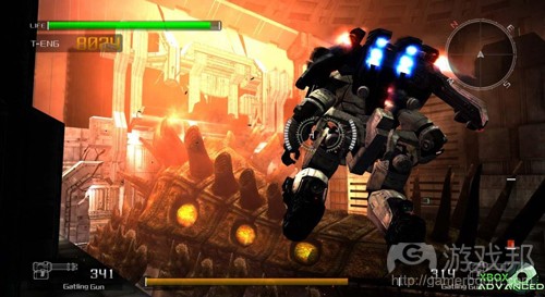
设计师也常运用绿色描述玩家安全的健康状态。例如下图所示的《失落的星球:极点危机》这款游戏的HUD。
红色
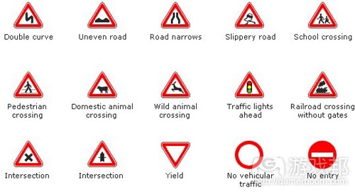
而红色通常用于表达与绿色截然相反的意境。对某些人来说,红色暗示危险情况,代表警告或一些消极内容,但如果是红色的心形则可代表爱情和激情。这种颜色也被交通灯所采纳,在英国有许多路标也使用了红色元素。
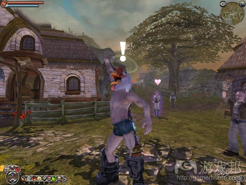
在游戏设计中,人们也在HUD中使用红色描述角色性命危险的状态,但也可以用红色健康条表达同样的意思。我认为这种用法的原因在于,红色总让人联想到鲜血,所以它很适用于游戏角色的健康条(如下图《神鬼寓言》的健康条)。
白色
白色通常被视为纯洁、宁静、恬静的象征,它会唤起一种淡定的情感。在游戏设计中,白色被广泛用于制作脱离背景色彩的图标、物品或文本,从而吸引玩家注意力,或向其指明具有重要意义的信息(如下图《神鬼寓言》中的白色标志)。
黑色
黑色是多数人公认的消极象征,它经常与黑暗、恐怖、邪恶或死亡形影不离。黑色与白色相反,常被视为与“正义力量”作对的“黑恶势力”。它和许多暗色被广泛用于创造封闭的环境,让这些环境看起来更加可怕,让玩家产生一种恐惧感。
灰色
与黑色一样,灰色常与沉闷、了无生气和死气沉沉相挂钩。现在人们经常用灰色制造玩家死亡的氛围,所以如果游戏视窗为彩色状态,玩家就仍有生命存在,如果视窗颜色淡出,也就意味着玩家已经毙命(游戏邦注:例如《质量效应》和《侠盗猎车手4》的用法)。
PS 3游戏《暴雨》使用灰色和暗色调制造一种沉闷的场景,让玩家立即产生一种寒冷、潮湿和阴郁的感觉。
黄色
与红色一样,黄色对一些人来说也带有对立的双重含义。有些人会将黄色与明朗、夏天和温暖相联系,由于这也是一种高反光的色调,它也常与黑色背景相结合,用于创造醒目的文本内容。
黄色还广泛用于生物危害的警告信息,交通灯则通过黄灯提醒路人绿灯将至,请注意路况。
《魔兽世界》使用黄色警告信息显示危险区域,强调玩家该区域并非久留之地。
粉红色
粉红色在最近十多年的游戏设计中运用较为普遍,它常与有趣或小女孩元素相联系,但最近已有更多成人用户也开始接受粉红色的产品。游戏公司常用这种色彩包装掌机设备,使其迎合更广的用户市场,向那些从未接触掌机设备的年轻女孩兜售产品。可见粉红色对世界的影响力更是不容忽视。
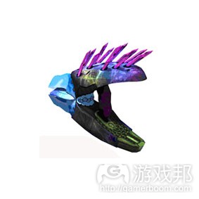
与白色一样,粉红色通常也用于制造游戏中的特殊物品,使其在周围环境中更为醒目,向玩家突出相关信息。《光晕2》和《光晕3》使用粉红色(以及其他异域色彩)代表Needler等外星武器。
只要使用得当,颜色会成为一种强大的武器,让游戏有效地向玩家提示信息。
游戏邦注:原文发表于2010年3月7日,所涉事件及数据以当时为准。(本文为游戏邦/gamerboom.com编译,如需转载请联系:游戏邦)
Colour within Game Design: Colours with Meaning
Colour is a very powerful thing. From a young age we are taught to associate colours with certain feelings, thoughts and meanings, even subconsciously. In games, designers use these associations to connect with the player and communicate with them subconsciously telling them that i.e. their health is getting low. By choosing to colour health green when the players health is between 75% – 100% in the health meter, and slowly changing to red when the health decreases from 75%, this will tell the player that when their health level is green this is ‘good’ and when it’s red that this is bad.
Colour can be used in the following areas of games: menus, the Heads Up Display (HUD), font and in the game window.
Colours with Meaning
Green
When people see green they immediately think ‘Go’ or of something positive. That is because green is used everyday in traffic systems and checking something off of a list i.e. the tick colour will most likely be green.
So a positive association with the colour green has been built up by us so whenever we see the colour green used we immediately think that whatever is being highlighted by that colour, be it either a word or icon, will be depicting positive information.Game designers quite often use green in games to depict a safe amount of health for the character via the HUD like in Lost Planet: Extreme Condition.
Red
When red is used it can mean two different and opposite things. To some it would immediately signify danger, a warning or something negative but when used in the shape of a heart can symbolise love and passion. Again this is to do with traffic lights, but also various road signs (in the UK) are outlined in red.
But of course, red is also used to colour heart shapes and signifies love.
In game design red can also be used in the HUD to depict a dangerously low amount of health for the character (when used in a health meter that changes from green to red) but can also be used as the entire colour of the health bar. The reason for this I think, is because when you think of health you think of blood and blood is red so it is an appropriate colour for the health meter as shown in Fable.
White
White is seen as a pure, serene and tranquil colour and it provokes a sense of calm from many. In games white is used in many ways. It is usually used to make icons, objects or text stand out against the environment or a dark background to draw the player’s attention to something significant or important. This is depicted in the Fable screenshot below.
Black
The colour black is mostly seen in a negative light as it’s usually associated with darkness, scary, evil and death. Black is considered the opposite to white and is considered the ‘bad force’ in constant struggle with ‘good forces’. In game design this colour and alot of other dark colours are used a lot to create enclosed environments and make them feel more dreary and create a sense of fear within the player.
The colour black is also used quite often with the colour white to display text. As they are the opposites of the scale, one reflects the most light and the other absorbs the most. So by putting black text on the top of a white background or white text on a black background helps the player by making the text visibly clearer (this will be further discussed in a later article).
Grey
Just like black grey is associated with dull, drained and lifeless feelings. Greys are now being used more often in death sequences of games when the player dies. So the colour in the game window represents life and being alive whereas when you die the window is drained of colour like in Mass Effect or Grand Theft Auto IV (this will be discussed further in a later article).
The PS3 title Heavy Rain uses greys and dark colours to create a dreary environment shown in the screenshot below. Immediately you get the sense of a cold, damp and unpleasant environment.
Yellow
Like red, yellow also has a double meaning with some people. To some yellow is associated with brightness, the summer and warmth. Also because it reflects light more than other colours it is generally used as a text colour against black backgrounds.
Yellow is also associated with warnings like biohazard signs. As the amber light on traffic lights suggests to pedestrians to be wary that the lights are soon about to change to green and they need to be clear of the road.
Games like the popular World of Warcraft use the warning association with the colour yellow by using it to tinge plagued and diseased areas to highlight to a player that this area is not completely safe to be in.
Pink
Pink has also been used more in games over the past ten years. Pink has mostly been associated with fun and baby girls but recently more people especially men have been adopting more pink products. Games companies have even used this colour to their advantage by colouring their consoles in a variety of shades of pink to help widen their market and sell their products to young girls who previously would not have touched consoles. So pink is definitely having a bigger impact on the world.
Within actual games pink, like white has been used to make certain objects stand out to players and show that they are not a part of the norm. In Halo 2 and 3 pink (and other exotic colours) are used to signify aliens weapons like the Needler.
Colour can be a very powerful thing when used correctly especially when implemented games. So make sure that when you use colours in your games you think about the meanings associated with them.(source:takeinitiative)
上一篇:解析以达尔文难度设计游戏的原理
下一篇:列举让玩家反感的5项游戏设计功能


