


阐述游戏设计需知的15大参考法则
作者:Tony
什么是电子游戏的“质量”来源?“优质”游戏具备何种“劣质”游戏所缺乏的元素?想要获得这些问题的答案,我们首先就得弄清游戏本质。从基础层面来看,所有游戏都由两大要素组成:设计和执行。设计是游戏的灵魂,而执行是游戏的躯体。
(1)设计是游戏概念、结构、意图和方向——设计是游戏设计师的职责所在。
(2)执行是指落实游戏概念的能力——执行是制作人、程序员和美工的职责所在。
艺术和编程工作很容易衡量。若游戏视觉效果突出,那么艺术任务就取得成功。若游戏运作良好,编程工作就算圆满完成。而设计却无法简单进行衡量——只有游戏富有趣味和沉浸性,设计工作才算大功告成。

Design from videogamewriters.com
身处游戏领域的人士都知道,游戏设计至关重要。若游戏毫无趣味可言,那么就无人会玩这款游戏。游戏或许具有杰出编码,唯美画面,但若根本设计存在缺陷,也无法变得有趣。所有领域(游戏邦注:从PC到掌机,再到手持设备)都充斥大量画面美观,制作上层的游戏作品。随着技术的进步,中间设备的涌现,成功作品同失败作品之间的区别逐步缩小,优质画面效果再也无法推动作品获得商业成功。电子游戏行业服务的是各不相同、富有经验的年轻群体,他们不再容忍糟糕设计。
既然游戏设计如此重要,那么围绕此话题的讨论应该早总结出系列设计方针,以防止游戏沦为设计糟糕的商业灾难,是吧?其实不然,很遗憾,虽然很多书籍谈及此话题,也有相关人士发表系列演讲,但设计“科学”(纯设计)还尚未获得明确定义。虽然游戏艺术和编程都有普遍质量衡量标准,都已成立相关教育机构,但设计依然处在直觉和辩论的魔幻王国之中。
那么为何发行创新游戏如此困难?
因为在项目开始前,确定设计质量衡量标准和项目进程非常重要。除非设计师也是工作室主管和发行商,否则设计团队很可能在项目获得准许前,需花费大把时间用于营销、交涉和妥协设计构思。目前设计师(更不用说自己)很难给予发行商明确设计允诺(游戏邦注:无非就是它和《Mario》有点相像,速度更快,有点忧郁)。为何开发公司不再制作大量大同小异的作品?
行业缺乏的是设计科学。或许人们没有付出足够努力,设计优秀游戏内容是因为他们认为游戏设计是个创意过程,创意无法通过系列规则明确定义。
要否定这个设想,区分设计和写作至关重要。写作是故事媒介(类似于书籍和电影脚本)。虽然优秀故事内容至关重要,但电子游戏不是书籍或电影,电子游戏是互动活动,游戏远比故事复杂得多。
从本质来看,游戏互动是综合心理学和数学的科学。设计师的任务是创造有所回馈、令人感兴趣的用户体验。目前这些目标的实现情况主要取决于经验人士的直觉、试验和错误测试。
虽然经验和天赋无可替代,但我们能从系列规则中受益(游戏邦注:这是设计过程的出发点或参考依据)。虽然这无非就是分警示清单,但制作此列表能够有效缓解设计师的肩上重担。设计师可以把它当作检验新构思的准则,或充当同其他开发部门协商功能设置的参考依据。更重要的是,规则涵盖禁忌的简洁符号列表能够有效避免徒劳的“疯狂追逐功能趋势”或令人沮丧的事后测评。
先后有序的完美设计规则列表并不存在,游戏设计没有灵丹妙药,没有成文法则告诉你如何修复游戏。相反,规则应具有普遍性,能够适应各种游戏和平台,所提供的理论要求要能够创造性地应用至任何情境。
设计关注焦点应为用户体验(奖励、满足感、易用性、调整、预期和关联性),以及各种管理人士和心理学家研究多年的心理刺激因素。
上文已给予充分铺垫说明,下面将逐一罗列15条设计原则:
1. 要有清晰设计目标
* 避免出现含糊性
* 玩家要能轻松进行“正确”操作,而“完美”操作具有一定难度,二者都应获得奖励。
2. 及时回应用户活动
* 用户应能确认其投入已被接受
* 尽可能及时呈现结果
3. 避免卷入不相关信息
* 去除多余元素让游戏流畅进行
4. 不要向用户提供不相关选项
* 自己能做的决定就不要烦扰用户
5. 不要打击用户
* 每次引入一个概念
* 维持最低程度的用户期望
6. 不要无视用户
* 将非机制故事进程最小化
* 快速“把握最近消息”
* 维持短暂学习曲线和指导过程
7. 不要惩罚用户
* 将奖励成就作为基本刺激因素
8. 说明如何弥补失败
* 若用户操作错误,告知其如何回到正轨
* 即便目标是弄清该做什么,也要给予相关提示
9. 始终满足用户期望
* 设定明确格式和玩法标准,且坚持到底
10. “伪装”完全是徒劳
* 以不同“颜色”呈现相同内容完全是徒劳
11. 让用户能够轻松访问重要选项
* “选项”包括任何形式的用户投入或回应,从“射击”到菜单中的“开始”选项
12. “减少按键操作”益处多多
13. “减少按键”效果更佳
14. 让用户能够轻松进行暂停、保存和继续操作
15. 设计劣质功能比未设置此功能还糟糕
为什么是15条原则?“有效”设计规则列表不应过于繁琐,这样大家便不会参考。但同样也不能太过简短,这样内容就会太过笼统,同样毫无用处。15条设计规则足够简洁,方便阅读,同时足够详细,便于理解。

Designer from videogamescholarships.com
1. 要有清晰设计目标
这是最重要的设计原则。用户若不知游戏目标以及如何操作,那他们就不会体验很久。一旦玩家知晓游戏目标,那他们就能自主决定如何实现,何时操作及体验多久。不要期望玩家会阅读游戏指南,或者甚至是观看截图。
这条原则适合总体目标和游戏中的琐碎任务。游戏目标应呈链条模式,从系列琐碎任务延伸至最终目标,玩家通过把握核心游戏机制完成琐碎任务(游戏邦注:玩家通过体验培养这些技能)。
在任何情况下,玩家都应问自己这样一个问题:“我要如何运用自己的技能完成这个任务?”要回答这个问题,他首先就得弄清要完成的任务是什么。
清晰目标能够确保玩家在受困时,通过多加练习便摆脱困境,无需进行过多搜索或思考。这是个重要差别,因为在前种情况下,玩家会因出现“快接近”目标感觉而备受鼓舞,而在后种情况下,玩家毫无概念自己要游荡多久才能发现相关线索。
这个原则的本质是玩家的核心任务应具有策略性(即便这个“策略”是“踢或击”),而不应平庸无常。
2. 及时回应用户活动
用户不应疑惑点击按键是否为系统记录。每次玩家投入游戏,不论是点击按键,口头命令,还是记录画面,都应该获得及时提示。在多数情况下,用户投入会激活某些游戏活动——射击、跳跃或建造,这些既带来视觉体验,又具有听觉效果。这个原则常在菜单活动中无法得到顺利落实,例如选择道具或变更背景。
所有用户行为都旨在推动游戏进展。从理想角度看,玩家成果应立即见分晓。如果玩家射击某敌人,他会希望即刻知道敌人是否已经丧命,假设玩家身处紧急情况,需同时应对多个敌人,那么一秒钟的延误都令其感到万分沮丧。
玩家不喜欢同时应对多个任务。需把握的次要细节(游戏邦注:例如决定什么举措会带来满意结果)越少,玩家从中获得的乐趣就越多。
从心理学角度看,人类习惯通过尝试和失误积累经验。决定将采取的行动,结果也就确定。两个活动的发生时间越接近,其关联性也就越密切,“学习过程”也就越快速。就像触动控制杆立马会造成冲击促使我们发现,完成游戏操作便立即获悉结果是个有效联想学习过程。
3. 避免卷入不相关信息
我们已在第一条中说过清晰目标是最重要的设计原则。这能够有效确保玩家在面对眼前信息时不会茫然失措。所有提供给玩家的信息都应该遵循一定发展脉络。当然这个基本原则并不排除喜剧性穿插之类的技巧。不必要交流应巧妙或明确移出游戏内容,这样才不会诱导玩家。
重要的一点是要呈现视觉信息。随着图片引擎日益复杂化,背景世界也逐步丰富和写实化。然而在传统精灵游戏中,我们总能轻松将情节道具(如皮卡和大门)同背景区分开。而现代游戏则要求我们小心区分互动道具和非互动道具。
从视觉角度看,游戏应按重要性排列(游戏邦注:最重要的内容应设置在突出位置,而琐碎内容则放置次要位置)。若玩家无法获悉取得成功所需的道具,定会感到沮丧至极。
4. 不要向用户提供不相关选项
游戏设计最失败的一点是无法取得预期交互效果。要求玩家决定显而易见的内容有些多此一举,且同活动毫无关系,在某种程度上还有些侮辱人。优秀经验法则应该是这样若你已知晓玩家选择,就不要再让他们自己决定。若你发现这个原则会去除你游戏内容的90%,那么你的作品根本算不上游戏,用户只会偶尔拜访,点击几下,然后翻页。
另一失败之举是给出“错误”选项。不要提供会把玩家带回相同决策环节的选择。典型例子就是给予玩家两个对话选项:
“见鬼去吧!”
“是的,我愿意帮你。”
玩家选择第一选项,游戏回复,“噢!”然后结束对话,迫使玩家得重返对话环节,再次面对两个相同选项。唯一的选择就是改选第二项。这是个虚假互动机制。
若第一选项带来诸如引发战斗之类的持续结果,那么决策就有效果,玩家未来表现无礼举止前就会三思、
5. 不要打击用户
假设玩家一无所知,假设他们只知道你在游戏中提供的信息。把游戏想像成一个受控环境。玩家在游戏初始需被告知所有基本控制装置,能够提示玩家“尝试”所有相关活动的试验环境是个理想选择(游戏邦注:比耗时的繁琐指南更有效果)。
每次只引入一个新概念。在引入新内容时,给予玩家试验新概念,尝试新“活动”的机会。若未给予机会,这些内容将很快被遗忘。
注意:要保持故事简洁性,即便游戏是个续作。内容需要同玩家保持关联。
6. 不要无视用户
假设玩家在空闲时没有任何关注内容。那么尽快让玩家沉浸至游戏当中,从那里引入故事内容。从理想角度看,预先故事应是无关紧要的内容。要让玩家觉得他们创造的是自己的故事,逐步提高他们的参与性。
不要浪费时间制作游戏指南,鲜有人喜欢被教导。玩家能从自己的尝试和失败中学到更多,早期探索能够有效强化游戏体验。包含提示语言的免费机制算是游戏入门,若你的游戏非常复杂,需提供指南,务必确保其简短和有效。让反应较慢玩家能够反复揣摩。
注意:保持故事趣味性,游戏是逃避现实的娱乐活动,所以给予玩家有趣内容,促使他们不断探索,享受新内容。
7. 不要“惩罚”用户
这是另一源自心理学的重要原则。游戏体验是个自发活动,多数玩家体验游戏只是为了消遣。不要羞辱、惩罚玩家,否则他们会产生反感情绪。
仔细找准“令人兴奋”和“令人苦恼”体验之间的平衡点(游戏邦注:前者需融入战胜和损失元素,后者包含沉闷和重复内容)。
应对困难任务时,玩家总希望能够握有一定胜算。若此期望无法获得满足,那游戏就难以激起玩家体验兴趣。
若玩家未能完成某个重要任务,毋令其沉浸于失败中,应立即提供新任务,分配新活动。积分积累应根据难度分阶段,这样玩家就无需重复相同内容。
另一需要考虑的内容是失败原因应停留于玩家引以为豪的技能。有些失败玩家能够容忍,但有些就难以接受。例如,在战斗游戏中,穿越迷宫就不是令玩家感到自豪的技能。玩家所有关注点都集中在快速反应、连锁组合和定时封锁,这是他们引以为豪的技能,是他们认为有挑战的内容。穿越充满致命暗礁的迷宫通常会快速破坏玩家在游戏享有的乐趣。
从本质来看,惩罚其实是个“公平”问题。公平是个主观衡量标准,但从经验来看不公平设计能为人们普遍感知。
8. 说明如何弥补失败
没有什么比失败却不知道原因更令人沮丧。若玩家要从失败中吸取教训,提高下次成功机率,那就需弄清失败原因。若因时间耗尽,显示计时器;若因伙伴死去,呈现信息或动画。说明失败原因其实也是告知玩家如何解决问题。若玩家继续失败,计算失败次数,逐步提供更多提示线索。没有设计师能够针对所有玩家调整游戏内容,所以呈现成功之路的状态机制是所有设计的优先考虑内容。
9. 始终满足用户期望
玩家投入时间体验游戏内容。除学习控制装置外,玩家还需适应设计师创造的游戏世界模式。就像上面提到的,促使玩家逐步融入游戏世界,告知他们如何进行互动非常重要。因此确保所设定游戏规则在随后进程中不被打破至关重要。若导弹发射会破坏所有东西,玩家就不会启动其开关,或者在高尔夫球游戏中,若操作目标是设立最短击球路线,那么就要确保近距离击球比远距离击球更易于执行。
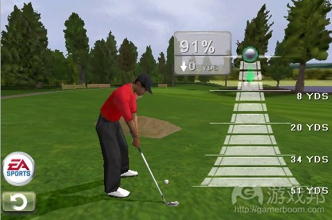
goft game from edibleapple.com
玩家就如何互动所需考虑的内容越少,其在游戏中的沉浸度越高。
10. “伪装”完全是徒劳
不要奢望你能够愚弄玩家,促使其再次体验相同内容却毫无察觉。随意“草草完工”或“重新粉饰”相同失败内容,以不同顺序呈现,无法将其变得富有新鲜感(游戏邦注:玩家记住的是过程而不是顺序或外观)。
开发引擎,告知玩家如何使用,然后在引擎约束范围内调整目标。覆盖大量地域主题,但未包含射击前行敌人或搜索弹药之外机制的的第一人称射击游戏难敌玩家需利用其智慧应对系列艰难处境,探索前进道路的作品。
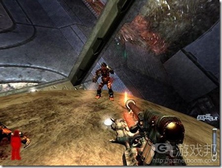
shooting game from phones-online.org
在衡量创造性选择方案,实现最低程度玩家-游戏互动,围绕细微差别设计谜题方面,创造性至关重要。就拿射击游戏来说,射击要求准确、数量,有谨慎射击、进攻射击、快速射击和花式射击。他们都基于同个机制,但体验过程和内容各不相同。
这不是说重复注定失败。若是奖励,同个游戏体验稍作调整后还是很欢迎。这是个奖励,所以玩家不会觉得设计师在欺骗他们。
11. 让用户能够轻松访问重要选择
在促使游戏活动凭借直觉操作和富有沉浸性方面,这是个关键举措。若某活动非常普遍或重要,给其设置突出按键。若玩家80%时间都在使用菜单选项,将其放在首位,让光标一开始就指向菜单。若玩家最可能进行进攻操作,将其设置为默认行为。这个原则应该延伸至游戏体验各方面。避免玩家进行系列操作或选择后,才获得单个结果。PC游戏有很多按键,而多数其他平台则未能如此幸运,因此需要更多创造性设计。
12. “减少按键操作”益处多多
这其实蕴含两个原则,减少多余互动周期和盲目频繁点击现象。
减少点击操作:
有效管理界面,这样玩家就能通过较少点击操作完成任务。若有可能,融入省力机制,从促使玩家能够“点击保存”到保存和预测用户决定。
无需进行大量操作:
玩游戏是个心理过程,控制器不过是玩家和游戏之间的桥梁。施加于控制器的压力越小,玩家的体验效果就越优。此操作无需经验或实践,因此快速点击按键只能带来些许满足感。游戏制胜“策略”不应改变操作手位,这样你就能通过食指快速点击按键。游戏不应打击玩家。
13. “减少按键”效果更佳
偷懒设计师常用的策略是添加额外按键。专注玩家会希望游戏减少登陆障碍,呈现凭直觉操作的简单界面。
多个按键就多个阻碍玩家沉浸于游戏之中的阻力。这是在将游戏打造成凭直觉操作的体验内容前,设计师需学习和把握的新“出发点”。游戏固有多数互动选择都应能够通常创造性使用既有按键实现,而无需借助新按键(游戏邦注:例如通过跳至X型物体,创造“漩涡”进攻,而无需设置专门按键,或从系列潜在活动中选择“漩涡”)。
控制器或键盘的按键存在组合可能性。想想通过一个按键能够实现的定时操作:A、AA、A暂停A,这个列表相当局限。现在来看看通过两个按键能够进行的操作:A、B、AB、BA、ABA、A+B、A暂停A、A暂停B……这个列表则相当广泛,在加入第三个按键前,我们需考虑所有组合可能。
调试新构思顺应既有范式要比重新定义模式简单得多。设计师的任务是让玩家能够凭直觉重复使用既有按键。例如,单个按键是浏览武器,双个按键是选择武器,并启动,这比将每个武器设置成不同按键直观得多。相比掌握武器在控制器/键盘的按键位置,玩家其实更易于记住点击几次按键方能操作武器。
14. 让用户能够轻松进行暂停、保存和继续操作
此原则源自列表中的其他要点,但这点非常重要,所以我们很难置之不理。
玩家投入游戏的所有活动都是靠保存系统维护。若系统出现问题,玩家定会心生不满,或给其控制器、掌机或电脑造成无法挽回的伤害。
令人惊讶的是,安装简单保存和加载系统有许多方式。制作此系统的关键在于考虑如下问题:
(1)玩家能否在两秒钟内离开游戏进行保存?
(2)若保存自动进行(游戏邦注:基于关卡),玩家能否察觉?
(3)若失败后会恢复原状,其能否接受其中受挫感?
(4)玩家恢复原状是否根据其最近保存状态?
(5)玩家是否能够发现其何时何地能够保存内容?
(6)性情温和的非理性玩家是否无法轻松删除游戏内容?
(7)电脑选择的恢复状态是否合理?(是否会令重返玩家感到惊讶?是否会以藏未完成娱乐活动?)
(8)玩家是否能够选择保存至受困状态?(能量消耗完时刻或生命终结时刻)
关于以上所有问题,你都需给予“肯定”回答。
15. 设计劣质功能比未设置此功能还糟糕
玩家能够识别糟糕设计。这会导致他们每次体验此作品,都心生不快。他们会抱怨心中不满。下次打算购买次开发商作品时,就会回想起之前玩过的游戏。
但玩家无从知晓未问世的功能。也许他们隐约会有“不足”或不完整感觉,但除非游戏无法进行,否则关于作品他们没有什么特别可挑剔的地方。
若你发现游戏功能违背上述某条原则,且无法修复,那你就应该考虑放弃此内容。当然这并不意味着你需因糟糕设计放弃所有游戏内容,相反设计师应探究失误根源,通过相关策略以最小损失移除此内容。
设计师需观察整个项目的开发过程,阻止糟糕设计潜入作品。糟糕设计有许多原因,或由于设计师的惰性,艺术或编程沟通失误,或由于错误功能,公司将检验工作委托他人,或由于作品出自糟糕设计师之手。不论出于什么原因,请记住以下两点:设计是个巧妙而精细的工作,设计师应谨慎对待;无知不再是失败借口。(本文为游戏邦/gamerboom.com编译,如需转载请联系:游戏邦)
The Rules of Design
By Tony
What is the source of ‘quality’ in a videogame? What is it that ‘good’ games have that ‘bad’ games do not? To obtain answers to these questions we must first be clear about the nature of games; at their most primary level, all games exist as the product of two factors; design and implementation. Think of design as the soul of the game and implementation as its body.
<!–[if !supportLists]–> 1. <!–[endif]–> Design is the concept, structure, intention and direction of the game – design is the responsibility of the designers
<!–[if !supportLists]–> 2. <!–[endif]–> Implementation refers to the skill with which the concept of the game is realized – implementation is the responsibility of producers, programmers and artists
Art and Programming are easily measured. If the game looks good, art has succeeded, if the game runs well, programming has succeeded. Design is not so easily measured – if the game is fun and immersive, design has succeeded.
It’s clear to anyone with a vested interest in the game industry that design is critical; if a game isn’t fun, no one will play it. A game could have the most brilliant coding and breathtaking art but if the underlying design is flawed the game simply won’t be fun. Every market, from PC to console to handheld is experiencing a glut of good-looking, high production releases. With technological advances and middleware evening the field, the spectrum differentiating a hit from a flop is narrowing – no longer will good graphics guarantee a commercial success. The video game industry has a young, savvy and discriminating audience – an audience with a decreasing patience for poor design.
If game design is so important, the discussion surrounding it must have long ago whittled down a tight list of guidelines to ensure the future is safe from poorly designed commercial disasters – right? Wrong – regrettably, although many books have been written on the topic and lectures given, the ‘science’ of design – pure design – has not yet been defined. Whereas art and programming have generally recognized measures of quality and established ancillary educational institutes, design still lurks in that magic realm of intuition and debate.
So why is it so difficult to release innovative new games?
Because it is important to have a clear gauge of design quality and project deadlines before beginning a project. Unless the designer is also the studio head and the publisher, there is a good chance that the design team will spend large amounts of time marketing, bargaining, begging, cajoling and compromising the design before the project even gets the green light for development. There is, currently, no way to provide publishers (much less, ourselves) qualifiable design reassurance (other than “He’s like Mario, only faster, and blue”). Is it any wonder that companies clog the game shelves with the same old thing?
What is lacking is the science to the process of design. Perhaps attempts have not been made to qualify good design because of the assumption that design is a creative process and creativity can not be defined by a list of rules.
In responding to this assumption, it is of foremost importance to make a distinction between design and writing. Writing is the medium of the story – similar to what is done in books and movie scripts. Although a good story is of paramount importance, video games are not books nor movies – video games are interactive and there is much more at work in a game than just a story.
Game interactivity is a science that is essentially somewhere between psychology and mathematics; designers are tasked with creating a rewarding, compelling and engaging user experience. The scope of achieving these ends has, so far, been determined by the intuition of experienced individuals and trial and error testing.
Although nothing is going to replace experience and talent, everyone can benefit from a set of rules – a starting point or a reference for the design process. Even if is nothing more than a checklist of things not to do, the creation of such a list begins to ease the esoteric burden from the ever-so-carefully monitored designer. Designers can use it as a guideline to check against new ideas or as a reference in negotiating features with other departments of the development team. Most importantly, a succinct, bulleted list of dos and don’ts would be an invaluable defense against time wasting ‘wild feature chases’ or demoralizing second-guessing.
A perfect, prioritized, list of design rules does not exist; there is no panacea of game design, no written law that will tell you exactly how to fix your game. Rather, the guidelines must be general, pertaining to all genres and platforms and offering conceptual requirements that can be applied creatively to any situation.
The focus of design should be user experience – reward, satisfaction, accessibility, adaptation, expectation and association – all psychological motivators of the sort that management gurus and lab psychologists have been aware of for years.
I’ve given more than enough introduction, so here’s my list with detailed explanations following:
<!–[if !supportLists]–> 1. <!–[endif]–> There should always be a clear objective
* <!–[if !supportLists]–> And little ambiguity to achieving that objective
* <!–[if !supportLists]–> How to do it ‘right’ should be easily determined – doing it ‘perfectly’ should be difficult – both should be rewarding
<!–[if !supportLists]–> 2. <!–[endif]–> Respond immediately to user actions
* <!–[if !supportLists]–> The user should be certain his input was received
* <!–[if !supportLists]–> Make results immediate, whenever possible
<!–[if !supportLists]–> 3. <!–[endif]–> Do not draw attention to irrelevant information
* <!–[if !supportLists]–> Cut the fat to make a sleek game
<!–[if !supportLists]–> 4. <!–[endif]–> Do not offer the user irrelevant options
* <!–[if !supportLists]–> Don’t bother the user with decisions you can make yourself
<!–[if !supportLists]–> 5. <!–[endif]–> Do not overwhelm the user
* <!–[if !supportLists]–> Introduce new concepts one at a time
* <!–[if !supportLists]–> Keep expectations of user knowledge minimal
<!–[if !supportLists]–> 6. <!–[endif]–> Do not underwhelm the user
* <!–[if !supportLists]–> Minimize non-gameplay story progress
* <!–[if !supportLists]–> Get ‘up to speed’ quickly
* <!–[if !supportLists]–> <!–[endif]–> Keep the learning curve and tutorials short
<!–[if !supportLists]–> 7. <!–[endif]–> Do not ‘punish’ the user
* <!–[if !supportLists]–> <!–[endif]–> reward success as your primary motivator
<!–[if !supportLists]–> 8. <!–[endif]–> Always explain how to fix failures
* <!–[if !supportLists]–> <!–[endif]–> If the user did something wrong, tell him how to do it right
* <!–[if !supportLists]–> <!–[endif]–> Even if the objective is to figure out what to do, give hints
<!–[if !supportLists]–> 9. <!–[endif]–> Remain consistent to user expectations
* <!–[if !supportLists]–> <!–[endif]–> Set clearly defined format and gameplay standards and stick to them
<!–[if !supportLists]–> 10. <!–[endif]–> ‘Dressing up’ cheapness will hide nothing
* <!–[if !supportLists]–> The same content in a different ‘color’ is completely redundant
<!–[if !supportLists]–> 11. <!–[endif]–> Make the most important option the most accessible
* <!–[if !supportLists]–> <!–[endif]–> ‘Options’ include any form of user input or response from ‘shooting’ to selecting ‘start’ from the menu
<!–[if !supportLists]–> 12. <!–[endif]–> ‘Fewer key presses’ is always good
<!–[if !supportLists]–> 13. <!–[endif]–> ‘Fewer keys’ is even better
<!–[if !supportLists]–> 14. <!–[endif]–> Make pausing, saving and resuming as accessible as possible
<!–[if !supportLists]–> 15. <!–[endif]–> A poorly designed feature is worse than a nonexistent feature
Why 15 items? A ‘useful’ list of design rules must not be too long –if it is, people won’t use it. Just as importantly it must not be too short or it will be too general and equally useless. 15 elements is short enough for each to be considered and detailed enough for each to be understood.
1: There should always be a clear objective
This is the most important design rule. The user won’t play long if he doesn’t know what the objective is or how to achieve it. Once the user knows what is expected of him, he then has the freedom to decide how he will do it, when he will do it and how much he’ll explore along the way. Do not expect the user to have read the manual, or even to have watched the in-game cut-scenes.
This rule applies to the overall objective as well as to every minor task encountered throughout the game. Objectives should form a chain, trickling downward from the ultimate game objective to smaller objectives that can be completed through mastery of the core game mechanics (the skills the user develops with play).
In any situation the user should ask himself only one question: “how can I use what I know how to do, to get through this?” To ask this question, he must first have a concept of what he is trying to accomplish.
A clear objective ensures that when the user is ‘stuck’ becoming ‘unstuck’ is a matter of more practice and not more searching or pondering. This is an important distinction because in the former situation, the user will be encouraged by the sensation of ‘getting closer’ to achieving the objective whereas in the latter situation the user has no idea how long he will be wandering before he stumbles upon a clue.
The essence of this rule is that the user’s concerns should always be strategic (even if the ‘strategy’ is ‘kick or punch?’), not mundane.
2: Respond immediately to user actions
The user should never wonder if a button press was registered by the system. Each time the user provides input, be it a button press, verbal command or camera-recorded movement, there should be an immediate indication of receipt. In most cases, the user input activates some form of in-game action – shoot, jump, build, etc. which has both a visible and audible effect. Where this rule more often fails is in menu actions such as selecting an item or changing a setting.
Every user action is performed in the attempt to produce an effect in-game. Ideally, the user’s success is determined immediately. If the user shoots an enemy, he immediately wants to know if the enemy is dead; even a one-second delay could be excruciatingly frustrating, given a hectic situation where the user is managing multiple enemies.
Gamers do not want to be bothered by juggling multiple concerns. The fewer secondary details that the user needs to keep in mind (such as determining which actions have produced satisfactory results), the more enjoyable the game experience will be.
Psychologically, a human learns through trial and error; an action is taken and the result is gauged. The closer in time these two events occur, the stronger the association is and the quicker it is ‘learned’. Just as touching a lever that delivers an immediate shock is a lesson not soon forgotten, taking an action in-game and seeing its immediate result is an effectively learned association.
3: Do not draw attention to irrelevant information
It was already stated in rule 1 that a clear objective is the most important design consideration. An important step in ensuring that the user is not confused is regulating the information presented to the user. All information presented to the user should promote the story arc. Of course, this ultimatum does not account for important human touches like comic relief. Non essential communications should be either subtle or clearly delineated from the game experience so that there is no confusion.
A related concern is the presentation of visual information. As graphics engines become increasingly more sophisticated background worlds are becoming increasingly lush and realistic. Whereas in old, sprite based games, it was easy to differentiate plot devices (such as pickups and doors) from the background; modern games must be careful to create contrast between items that may be interacted with and those that may not.
Visually, the game should be arranged in order of importance – the most important aspects should stand out the most and progress in visual obscurity to the least important. Frustrations can quickly mount for players who can’t identify the very tools they need to succeed.
4: Do not offer the user irrelevant options
One of the greatest failures of game design is the inability to recognize desirable interactivity. Asking the user to make an obvious decision is excessive, irrelevant and, in some ways, insulting. A good rule of thumb is that if you already know what the user will select, don’t bother asking the user. If you find that this rule cuts out 90% of your game, you really don’t have a game at all – you have a story where the user is periodically called upon to press a button to turn the page.
Another, related, failure is the ‘false’ option. Do not offer an option if it immediately returns to the user back to the same decision branch. An example is offering the user two dialog options:
“Go to hell!”
“Yes, I would be willing to help you”
The user selects the first option and the game responds, “hmmph”, ending the dialog and forcing the user to reinitiate the dialog at which point the same two dialog options are offered – the only way to proceed is to select the second option. This is fake interactivity.
Should the first option produce a lasting result such as instigating a fight, the decision becomes valid and the user will think twice before acting impolitely in the future.
5: Do not overwhelm the user
Expect that the user knows nothing; assume only what you have taught the user in-game. Think of your game as a completely controlled environment. The user should be given an opportunity at game start to get a feel for all of the basic controls; a simple sandbox situation with prompts to ‘try’ all of the relevant actions is ideal (and more effective than any pedantic and time-consuming tutorial).
New concepts should be introduced one at a time. Give the user the opportunity to test new concepts and try out new ‘moves’ as they are introduced – if you don’t they will be soon forgotten.
*A little note for the writers: Keep the story simple, even if the game is a sequel – it needs to be something that the user can relate to.
6: Do not underwhelm the user
Assume that the user has no attention span when unoccupied. Immerse the user in game-play as soon as possible and introduce the story from there; ideally the pre-story should be inconsequential – the users should feel that they are creating their own story which begins with their involvement.
Do not waste time on condescending tutorials – no one likes to be taught. Users will learn best from their own trial and error and early discoveries will develop critical positive reinforcement for the game experience. Free-form gameplay with prompts should suffice as an introduction and if your game is just so complex that it absolutely needs a tutorial, make it as short and as active as possible – let the slower users repeat it if they don’t get it the first time through.
*One more note for the writers; Keep the story interesting; this is escapist entertainment so give them excitement, discovery and new experiences.
7: Do not ‘punish’ the user
This is another important rule borrowed from psychology. Game playing is a voluntary experience – most people do it for recreation. Do not shame, punish or otherwise irritate the user.
There should be a careful balance between creating an ‘exciting’ experience, which requires the possibility of defeat and loss, and an ‘excruciating’ experience which is simply tedious and repetitive.
The user should expect a reasonable chance of success each time he undertakes a difficult task. The game ceases to be exciting as soon as he expects to fail.
If a user fails a critical task, do not allow him to dwell on the failure – immediately reengage him and restart him on a new attempt. Accordingly, save points should be spaced relative to difficulty so that the user never has to repeat too much to make a repeat attempt.
Another important consideration is that the condition of failure should rest on a skill in which the user has invested pride. Certain failures the user will endure, others he will not. For example, in a fighting game, navigating a maze is not a skill in which the user has invested pride. All of the user’s focus has been on quick reactions, chaining combos and timing blocks – this is where his pride is and where he expects challenges. Navigating a maze of precarious ledges that leads, often, to death will quickly undermine the user’s enjoyment of the game.
Essentially, punishment comes down to a question of ‘fairness’. Fairness is arguably a subjective measure, yet experience shows that unfair design is universally recognizable.
8: Always explain how to fix failures
Nothing is more frustrating than failing a task and not knowing why. If a user is to learn from the experience and increase his chances of succeeding the next time, the cause of his failure must be clear. If time ran out – draw attention to the clock, if an ally died – display a message or an animation. By indicating the source of the failure, you should also be providing a hint for how to solve it. If a user continually fails, count the failures and provide progressively more leading clues. No designer will balance a game perfectly for every user so a dynamic system that naturally suggests the route to success should be a priority of every design.
9: Remain consistent to user expectations
The user is making a time investment in playing your game. Aside from learning the controls, the user must adapt to the whole paradigm of the game world you have created. As mentioned above, it is important to gradually introduce the user to the game world and teach him how to interact with it. Therefore it is of the utmost importance that the conventions you set are not broken later in the game. If your missile launcher destroys everything it hits, don’t expect the user to consider using it to activate a switch or, in a golfing game, if the object of driving is to set up the shortest possible putt, make sure that a short putt is actually easier to execute than a long putt.
The less the user has to think about how to interact, the deeper his immersion will be.
10:‘Dressing up’ cheapness will hide nothing
Never think that you can fool the user into replaying the same content without his noticing. Randomly ‘shuffling up’ or ‘re-skinning’ the same defeated challenges in a different sequence will not make them any fresher – it is the process that a user remembers, not the order or even the look.
Develop an engine, teach the user how to use it and then vary the objectives within the constraints of the engine. A fps that crosses a wide range of terrain themes but contains no gameplay beyond shooting advancing enemies and searching for ammo is significantly less compelling than one in which the user must use his wits to shoot his way out of a variety of unique situations.
Creativity is key, to take stock of your creative options, go to the lowest level of player-game interaction and devise puzzles around every nuance. Take shooting for example; you’ve got shooting for precision, shooting for quantity, shooting conservatively, shooting aggressively, shooting quickly, shooting in patterns – they all involve the same base mechanic but they vary the process and the experience.
This is not to say that replay is a lost cause. If it is presented as a reward, subtle variation of the same game experience is perfectly welcome – it’s a bonus so the user does not feel that the designers are cheating him.
11: Make the most important option the most accessible
This is another key step in making the game experience intuitive and immersive. If the action is common or important, give it a prominent button. If a menu option is used 80% of the time, list it first and start the cursor on it. If the user is most likely to attack, make that the default action. This principle should extend to every aspect of the game experience. The user should never have to undergo a sequence of actions or choices just to arrive at a single result. PC games have lots of keys; most other platforms are much less blessed and require greater creativity of design.
12:‘Fewer button presses’ is always good
There are actually two principles here under the same umbrella; reducing both excessive cycles of interaction and mindless repetitive, button-smashing controller abuse.
Planning for fewer presses:
Organize your interface so that the user makes the minimal number of button presses to perform an action. When possible, integrate effort-conserving mechanisms that can range from as simple as enabling the user to ‘press and hold’ to saving and predicting user decisions.
No more smashing and mashing:
Playing a game should be a mental experience – the controller is simply a conduit between the user and the game. The less strain placed on the controller, the more comfortable the experience will be for the user. Because it is something that requires no experience or practice, pressing a button rapidly ‘enough’ gives little satisfaction. The winning ‘strategy’ to a game should never be changing your hand position so that you can pound a button rapidly with your index finger. Besides, the last thing a game should do is give the user blisters.
13:‘Fewer buttons is even better
Adding extra keys is a tactic too often used by lazy designers. All but the most dedicated, self-righteous gamers will appreciate the low barrier of entry allowed by an intuitive and simple interface.
Each button introduced to the user is a further obstacle to immersion; it is a new ‘starting point’ that must be learned and absorbed before it can become intuitive. The multitude of interactive options intrinsic to your game should be accessed through creative use of existing buttons and not through new buttons (for example, consider jumping on an object of type X to create a ‘vortex’ attack, rather than a dedicated button or selecting ‘vortex’ from a list of potential actions).
The buttons on a controller or a keyboard have latent combinational potential. Consider what can be done with one button and creative timing: A, AA, A pause A – the list is rather limited. Now consider what can be done with two buttons: A, B, AB, BA, ABA, A+B, A pause A, A pause B, etc. The list is rather extensive and all of these combinational possibilities should be considered before adding a third button.
The human brain can more easily adapt new concepts to its existing paradigm than to redefine that paradigm. The task of the designer is to make the reuse of existing buttons intuitive. For example, a single button to cycle weapons and a second button to select a weapon and also to fire it, is much more intuitive than a system assigning each weapon to a different button. A user is actually more likely to memorize the number of button presses needed to access a desired weapon than to memorize the location of that weapon’s button on the keyboard/controller.
14: Make saving and resuming as accessible as possible
This one could be derived from other points on this list but it is too important to leave to extrapolation.
The entirety of the user’s dedication to your game is safeguarded by your saving system. Should that system fail, the user will likely curse your existence and quite possibly inflict irreparable damage upon his controller, console or computer.
It is surprising how many different ways there are to implement a simple save and load system. At the forefront of your development of this system should be a number of questions:
<!–[if !supportLists]–> 1. <!–[endif]–> Can the user move from gameplay to saving in under two seconds?
<!–[if !supportLists]–> 2. <!–[endif]–> If saving is automatic (‘checkpoint’ based) will the user be made aware?
<!–[if !supportLists]–> 3. <!–[endif]–> If the user fails and must revert, will his frustration level be acceptable?
<!–[if !supportLists]–> 4. <!–[endif]–> Will his reverted status be unchanged from when he saved?
<!–[if !supportLists]–> 5. <!–[endif]–> Is the user aware of when and where he can save?
<!–[if !supportLists]–> 6. <!–[endif]–> Is it difficult for a mildly emotional and irrational player to accidentally delete his game? (Damn you Banjo-Kazooie!)
<!–[if !supportLists]–> 7. <!–[endif]–> Are computer-selected reversion points intelligently selected? (Do they avoid surprising a returning/respawning user? Do they conceal imperfect state recreation?)
<!–[if !supportLists]–> 8. <!–[endif]–> Is it impossible for the user’s only save to be in a ‘stuck’ state? (out of fuel, one bar of life, etc)
All of the above questions should be answered ‘yes’.
15: A poorly designed feature is worse than a nonexistent feature
Users will notice bad design. It will rub them raw every time they play your game. They will complain about it. They will be reminded of it when they consider buying your next game.
Users will not notice nonexistent features. Perhaps, they will notice an indefinite ‘absence’ or a sense of incompletion, but, unless the game is unplayable, this is nothing they can specifically fault you for.
If you recognize that a game feature fails one of the preceding rules and it can’t be fixed, you should seriously consider removing it. Of course this does not mean that entire sections of the game should be canned because of poor design, rather a designer must locate the germ of the flaw and strategically effect its removal with the minimal amount of collateral damage.
As the designer, you are responsible for watching the project as it develops and safeguarding it from the insidious creep of bad design. Bad design has many sources; designer laziness, miscommunication with art or programming, feature juggling, delegating the supervision of implementation, and even ‘helpful’ rouge designers. Whatever the threats, there are two things to remember; one: the design is a wonderful and delicate creature that honorable designers must strive to protect; two: ignorance is no longer an excuse for failure.(Source:ventrice)

")
")
")
")


 闽公网安备35020302001549号