探讨游戏设计中用户界面的各种形式
作者:Josh Bycer
当我开始筹备《巫师2》的分析报告时,我的内部设计师对于我提出的游戏UI问题大加抱怨。如果你认为整整三页的游戏设计怨言不能称之为评论的话,可以选择看看下面这篇文章。
无论你的游戏有多棒或者视觉效果有多华丽,劣质的UI足以将其完全摧毁。讨论UI遇到的难题是,每个题材都有着自己的风格和需要传达的信息。出于此原因,我将在本文中探讨某些通用的正确做法和错误做法,以及分析两类我对其UI设计特别熟悉的游戏题材——RPG和战略/城市建设游戏。
作为游戏设计师,在设计UI时你首先应该考虑的问题是,什么才是对玩家最重要的信息?原因在于,你应该尽量让玩家易于察觉这个信息。
在RPG和战略游戏中,它们利用的是多屏信息。你应该避免承载信息的屏数过多。现在有些4X战略游戏让玩家通过至少3屏方能明白他们的经济状况以及收入是否正在下滑。如此这般隐藏信息会让你的游戏难以上手,而且让UI变得很复杂。
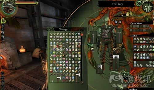
你需要尽量保证相关信息呈现在同一个位置处,如果有必要的话,多次重复显示信息也是个不错的做法。比如,《巫师2》的玩家只能在仓库中看到他们有多少材料用于炼金,但在炼金界面却看不到材料的数量。作为游戏设计师,当你在游戏测试时发现需要切换多个界面才能完成某项任务,那么就要对此进行修改。在以前的RPG中,有些游戏并没有在装备界面中显示新装备的属性,这使得玩家不得不来回在仓库和装备界面中切换,确认新装备确实能够使角色得以提升。
战略游戏最突出的便是,有大量需要玩家理解的信息。这便是能显示出优秀UI概念的关键所在。在多数战略游戏中,几乎不可能单屏呈现所有的信息。你需要找到让界面保持清晰的媒介,同时向玩家呈现信息。《全面战争》和《文明》系列游戏在这一点做得很不错。
这两款游戏都有主界面,玩家可以看到快乐度、货币数和单位位置等重要信息。单击或将鼠标指向城市,便可以看到更多进展中的信息。最后,他们可以双击城市来查看所有的数据。这种做法的主要优势在于,他们可以保持主界面的简单,不堆叠着大量的信息。
这种开放性设计的弱点是那些链接至其他界面的小图标。尽管这些小图标让界面变得清爽,但找到某些单位就变得有些困难。当我首次尝试玩《文明4:殖民统治》时,那些小图标让我感到很茫然。如果你想要采取这种做法,可以用指导文件来帮助玩家理解正在发生的事情。
应该注意到,现在有一种“过于开放”的UI。玩家在主界面看不到任何东西,所有的信息都要通过鼠标点击多个窗口后才能呈现。我在《领土之战》系列游戏熟悉UI的过程中显然花的时间更多。
近期我在《工人物语7》中看到了另一种概念,它利用的是动态信息窗口。界面顶端有个资源显示窗口。当玩家没有选择任何东西时,上面显示的是王国最重要的资源:人口、工具、食物和黄金。当玩家点击建筑或准备建造某些东西时,窗口显示的是建筑相关信息。比如,面包房需要水和面粉来生产面包,当你选择面包房时,你会看到还有多少可用的水和面粉。如果玩家想要查看所有资源,可以点击位于界面底部的资源窗口。
制作优秀UI是个非常艰巨的任务,有些设计师觉得很容易理解的设置可能让玩家觉得非常难理解。以上所探讨的并不完整,正如我在上文中提到的那样,每款游戏都有自己的UI。(本文为游戏邦/gamerboom.com编译,如需转载请联系:游戏邦)
A Look At UI Design Part 1: A Quick Examination.
Josh Bycer
As I worked on my analysis of The Witcher 2, my inner designer was screaming out loud over all the UI issues I had with the game. Since you can’t call three pages of rants at game design a review, consider this my form of venting.
No matter how great your game is or how good looking, if it has a horrible UI, it could be enough to ruin your game. One difficulty of talking about UIs is that every genre has its own style and information to convey. For this entry, I’m going to talk about some general dos and don’ts and talk about two genres that I’m the most familiar with when it comes to UI design: RPGs and strategy/city builder.
The first thing as a designer that you have to think about when coming up with the UI is, what is the most important information to the player? The reason is that you want this information to be as easily found by the player as possible.
With RPGs and strategy games, they make use of having multiple screens of information. You want to avoid having your information strewn across multiple screens of information. There are 4X strategy games out there that have the player going through at least three screens to see how their economy is and if they are losing money. Burying your information like this makes your game harder to learn and can make your UI convoluted.
You want to try to keep relevant information together and it is fine to repeat information in several areas if it will be used there. For instance, in The Witcher 2, the player can only see how many ingredients they have for alchemy in the inventory, not when they are on the alchemy screen. As a designer, when you are testing your game, if you find that you have to switch between multiple screens to accomplish a single task that should raise a red flag. With older RPGs, the game may not show the attributes of new equipment from the equip screen, forcing the player to go back and forth between their inventory to make sure that their new gear will actually improve their characters.
Strategy titles are known for having numerous pieces of information for the player to understand. This is where the concepts of a good UI can clash. It is not possible in most strategy games to have all the information present on one screen without overloading the player with information. Instead you need to find a happy medium between keeping things clean, while presenting information to the player. Series like Total War and Civilization have been working on this.
Both games have the main screen, where the player will see the most important information such as: happiness, total gold, unit position and so on. By keeping their mouse pointer or single clicking on a city, they can get a little more information about what’s going on. Finally, they can double click on the city to get all the data there is. The main advantage to this style is that it allows them to keep the main screen from being cluttered by information.
One negative to this open design, is the use of small icons that are either commands or links to other screens. While it keeps the screen clean, it also makes it a pain to find what you’re looking for. The first time I tried Civilization 4: Colonization I was greeted by a bunch of little icons with no idea what they were for. If you are going to go this route, tool tips can help players understand what is going on.
Also it is important to realize that there is such a thing as a “too open” UI. If the first thing the player sees is a main screen that shows nothing, with all information hidden behind mouse clicks and multiple windows, that can raise the learning curve dramatically. As evident by my time spent trying to play the Dominions series.
Another concept I saw recently in The Settlers 7 was the use of dynamic information windows. How this worked was at the top of the screen, there was a resource display window. When the player does not have anything selected, it shows the most important resources to your kingdom: population, tools, food and gold. Whenever the player clicks on a building or is about to build something, the panel displays relevant information to that building. For instance, a bakery requires water and flour to produce bread, when you select a bakery, you’ll see exactly how much of each resource you have available. If the player wants to view all their resources, they can click on the resource window at the bottom of the screen.
Creating a good UI is a very difficult task, what the designer may find easy to understand, could be completely esoteric to the player. This is by no means a complete look, as mentioned at the start; every genre can have its UI analyzed. That does it for part 1, in part 2 I’m going to pay tribute to the Nintendo DS and what dual screens did for UI handheld design , in part 3 I’m going to tackle why one of the best games of all time, has one of the worse UIs of all time. (Source: Gamasutra)


 闽公网安备35020302001549号