


iPhone游戏应满足玩家快速体验需求
作者:Steve
PopCap(游戏邦注:它是《幻幻球》和《植物大战僵尸》开发商)早前调查了手机游戏体验最频繁地点。调查结果显示,工作中体验的男性(28%)数量超过女性(17%)。调查还研究了手机游戏体验时间。两大族群都主要利用“约会等待时间”,我早就猜到这会是首选,因为“上厕所”不在其中。
这些结果表明用户希望手机游戏能够是“随处登陆,快速体验”的活动,他们能够利用游戏打发时间,体验不会占用大量时间。因此游戏设计师应该完善次类体验方式,让玩家能够随处登陆,参与体验。其中需要注意的元素是:
* 短暂启动时间(游戏邦注:从应用加载到真正体验)
* 体验前仅需浏览少量附加菜单
* 能够继续上次体验
* 应用能够迅速终止,停止不会丢失进度
玩家启动游戏后会希望能够尽快进入游戏当中。玩家最初需等待加载,即便优化程序也难以解决此问题,这是个无法避免。然而,开发商若关注用户体验,就应该采取措施减少加载到真正进入游戏中间的步骤。
这里我们就需要根据用户期望进行换位思考。游戏类型如此之多,我们可以假设用户有其钟情模式,希望重返其当前游戏,或希望开始新游戏。复杂游戏会有众多不同选择需向用户呈现。那么我们要如何判断这些选择是否为玩家需要呢?比专家“有根据猜测”更高效的办法是定性测试,或通过投放应用商店前的限量发行(我想应用商店能够让你获得100名玩家,这数量已足够进行抽样调查),或采用提早发行“诱惑”手段,这会记录、反馈玩家行为细节。若你发现87%玩家加载游戏后,直接“继续游戏”,那么你可以让该步骤自动化,减少玩家等待时间。
设计游戏高效“进入方式”非常适合进行基于用户行为的广泛定性测试,这能够有效影响玩家意志及其游戏“印象”。简单地说,如果玩家知道他们能更快加载游戏(游戏邦注:相比原先的30秒等待时间,需浏览5个页面菜单而言),他们会更愿意利用排队参加聚会时间玩游戏。
表现突出作品

textropolis from mentalfloss.com
Ian Marsh的字谜游戏《Textropolis》就是个成功典范。点击该游戏,经过短暂加载时间后,玩家便能够进入游戏,游戏没有设置菜单选择(当然你可以选择回到游戏菜单,但正如游戏假设的那样,多数玩家不需要此步骤)。游戏性质促使其能够快速启动,所以这也是款非常适合手机平台的游戏。但游戏也不乏功能设置,玩家能够输入个人资料,但游戏默认多数玩家只是纯粹想玩游戏。《Textropolis》的短暂启动时间使得游戏非常符合Popcap调查报告显示的用户需求。
我本来打算在此分析Bryan Mitchell推出的字谜游戏《Geared》,这款游戏加载速度很快,我似乎从未见过游戏加载页面。但我发现游戏不会保存进度,因此其用户体验还是不够完善!
表现不佳作品
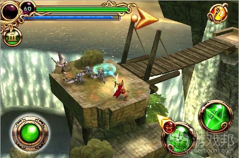
Hero of Sparta from videojuegosiphone.com
《Hero of Sparta》是Gameloft推出的双剑手攻击游戏(游戏邦注:不妨参考PS2的《星际大战》和《指环王》游戏)。
所以,如果离会议开始还有5分钟,不妨体验一把。启动应用便出现加载页面,然后是一分钟截屏,我之前看过该画面,所以我会选择跳过。接着是另一加载页面,一个标题页面。点触屏幕开始游戏。选择新游戏或者继续,显然我会点击继续,然后是选择回合,我自然会选择我正在玩的那个回合,然后又是个加载页面,最后才进入游戏。
在决定体验和真正进行体验之间,我需要选择很多内容。这也是我很少玩这款游戏的原因所在。
游戏要如何完善呢?
完成首个加载步骤后,我就不希望再次看到开头场景(尽管其画面非常绚丽多彩)。标题页面融入不必要点击内容。虽然我并没有进行调查,但我相信玩家开始游戏后更希望“继续”游戏而不是选择“新游戏”。
游戏邦注:原文发布于2009年10月23日,文章叙述以当时为背景。(本文为游戏邦/gamerboom.com编译,如需转载请联系:游戏邦)
Mobile Games should start quickly (lets get down to business!
by Steve
PopCap, they of Peggle and Plants Vs Zombies, commissioned a survey on where most people play mobile games. Results showed that men play more at work (28%) than women (17%). They were also asked when do they play these games. “while waiting for an appointment” came first for both genders, although I imagine this is because “on the toilet” wasn’t an option in the survey (I’m not judging… just saying!).
What these results show is that people want mobile games to be ‘pick up and play’, and use them to fill time, as opposed to committing a large amount of time to playing them. It is therefore important that game designers facilitate this method of game playing, and make it easy to pick up and play games. The main elements of this are:
* fast start up time (from app load to actually playing)
* low number of extraneous menus to navigate before playing
* app resumes from where it left off
* app shuts down quickly, but doesn’t lose progress
A previous blog post touched on the issue of apps resuming your progress after an exit, and so this topic will focus on the user experience starting (or resuming) a game.
The player, when they start the game, wants to play as soon as possible. Initially they have to sit through a load screen, which beyond the abilities to reduce this by programming optimization is a necessary evil. However, as developers interested in ux, steps should be taken to reduce the number of steps a user has to go through after this to reach the game.
There is a trade off that has to be made here, based on our assumptions of what the user wants to do. With many types of games we can assume that the user will already be on their right profile, will want to resume a current game, or start a new game. More complex games may have a wider degree of options that they need to present the user (particularly on a first boot). So how do we decide what options the majority of users will require? More effective than experts’ ‘educated guesses’ would be qualitative testing – either through a limited release prior to the app store (I believe apple allows you to distribute your app to 100 people, enough for a good sample group), or through ‘hooks’ in the code of early releases, which will log, and send back, details on user activity. If you then found that 87% of users, on loading a game, went straight to ‘resume game’, you could make the game do this automatically, and reduce their wait.
The design of an effective ‘entry method’ into the game is incredibly well suited to large user tests, based on qualitative tests of user behaviour, and can have an enormous effect on a player’s good will and ‘feeling’ about a game. Put simply, if player’s know that they can load your game quickly, compared to one with a 30 second wait, and 5 menu screens to navigate, they are more likely to pick your game when waiting in a queue or for a meeting.
Who does it well?
Textropolis, the word guessing game by Ian Marsh. Click on the app, and after a short load screen you’re playing the game – no menu options (obviously you can get back to the menu, but the game assumes, correctly, that most players will not need this). The nature of the game (no time crucial element), lend the game to a quick start, so this is also a fine example of a game design being suited to its platform. The game isn’t lacking in features too – the ability to sign in as separate user profiles exists, the game assumes that you will be less likely to want to do this than just play. Textropolis’ quick start up time would make this game a suitable choice for the sort of quick gaming that Popcap’s user survey says mobile gamers are into.
NB: I was going to feature Geared, the puzzle game by Bryan Mitchell here, as it loads quickly, and I cant remember having seen the title screen (it throws you straight into the game). However when writing this, I realised it doesn’t save your progress on a puzzle when you exit/re-enter, and hence it loses user experience points!
Who does it badly?
Hero of Sparta, the (rather epic) hack and slash game by Gameloft (Think those PS2 Star Wars/LOTR games).
So, we’ve got five minutes before the meeting starts, lets play. App started. A load screen, then a one minute cut scene, ok, I’ve seen it before, so I’ll skip this. Another load screen. A title screen. Touch the screen to continue, ok, I’ll do this. New game, or Continue. Obviously I want continue, so I select this. Select a chapter. Well, I’ll select the one I’ve been playing on. Great. Another load screen. And I’m in.
That’s a lot of stuff to get through between deciding I want to play, and actually getting to play. Probably one of the reasons why I haven’t devoted much time to playing this game.
How could it be improved?
After the first load, I’ll be unlikely to want to watch the opening cutscene again (despite the flashy graphics). The title screen adds needless clicking to my experience. Although I haven’t verified this with testing, I believe the player is likely to select ‘continue’ rather than ‘new game’ after they’ve started playing. (Source:stevebromley)

")
")
")
")


 闽公网安备35020302001549号